Calibration Curve in Excel 101 & How to Create One
Excel is one of the best-known pieces of software that comes with built-in features that come in handy in helping you display your calibration data whether it comes from ApilTags, Checkerboards, Circle Targets, or a Circle Grid Pattern. It will help you come up with a line of best fit to program a correction factor into a piece of equipment.
Try our Free Calibration Pattern Generator to explore which pattern works best for your application.
Microsoft Excel features charting tools that offer an excellent way of plotting the known relationships of ordered and unordered pairs.
Here, we'll look at how you can use Microsoft Excel to create a chart, how to plot a linear calibration curve, and how you can display the liner curve formula. Additionally, we'll look at how to use the SLOPE and INTERCEPT functions to do the calibration equation in Microsoft excel.
What Is a Linear Curve and How Is Excel Useful When Creating One?
During calibration, you compare the readings of a device, such as the readings that a thermometer displays, and compare them with known values, referred to as standards. Examples of standards include the boiling points and freezing points of water.
The comparison helps you come up with data pairs that you can use to come up with a calibration curve.
If you calibrate a thermometer using the freezing and boiling points of water, you'll end up with two data pairs. The first pair will be when you put it in ice water (320F or 00C) and put it in boiling water (2120F or 1000C).
You can plot the two data pairs and draw a calibration curve between them. If the thermometer has a linear response, you can pick any point on the line that will correspond with the value of the thermometer display, and you'll get the corresponding true temperature.
Thus, the line helps you to fill the information between the two known points to be certain when you want to estimate the actual temperature when the thermometer is reading 57.2 degrees, but you haven't measured the standard that corresponds to the reading.
Microsoft Excel comes with features that help you plot the data pairs in a chart, add a calibration curve (trendline), and display the curveé equation on the chart. Plotting the data pairs in the chart is essential for data display. Alternatively, you can calculate the equation of the line using the SLOPE and INTERCEPT function in Microsoft excel. When you enter the values into simple formulas, you will calculate the true value using any measurement.
A calibration curve is essential in understanding calibration data and getting insights into the instrumental response to an analyte. Additionally, you can use a linear calibration curve to help you to predict the concentration in a sample of a solution.
You create a calibration target curve by first preparing some standard solutions with known concentrations of the analyte sample (see also ChArUco targets). Then, you measure the instrument response for each sample and then compare it to the concentration of the standard solution.
You can then use the linear calibration curve to predict the concentration of a sample of the solution by relating its instrument response to the concentration of the standard solution.
How Do I Create a Calibration Curve in Excel?
Coming up with a calibration curve in excel is a straightforward process. You need to follow a few steps to ensure you end up with the proper calibration curve.
What steps should you follow to ensure you create a calibration curve?
To demonstrate how to create a calibration curve in Microsoft Excel, we'll develop ten data pairs that we'll use as examples. The data pairs will represent x-values and y-values.
In our example, the x- values will represent the standards, while the y-values will be our responses.
After getting the calibration curve, we'll use the SLOPE and INTERCEPT functions to calculate the formula of the calibration curve.
Step 1: Open the Data Source
In the first step, you should open the Excel workbook that contains the known values that you want to plot on the calibration curve. You should arrange your data in pairs and enter one pair to a row with the values in adjacent columns.
It will be best if you get appropriate headings for the data columns. If the data requires a specific order, you should sort by one of the columns. You can have your data arranged in X-value and Y-value columns.
Step 2: Create a Calibration Curve
The next step involves creating the calibration curve. To create the curve, you should start by highlighting all the data that you wish to use.
First, select the column cells for the x-value. You can click on the heading in the right-hand column of the data labeled as x. Left-click and hold the mouse down and drag the mouse pointer down to the last cell in the column.
Next, click on the Ctrl key and select the column cells containing the y-value. Drag the mouse pointer down to the last cell in the column.
Next, go to the "Insert" tab on the Microsoft Excel sheet. When the option is open, navigate to the "Charts" menu and then go to the "Scatter" dropdown. When you click on the Scatter icon, it will open to display a variety of scatter chart variations. Go to the "Markers Only" option to get a scatter chart with a marker representing each data pair.
Step 3 Add Trendline
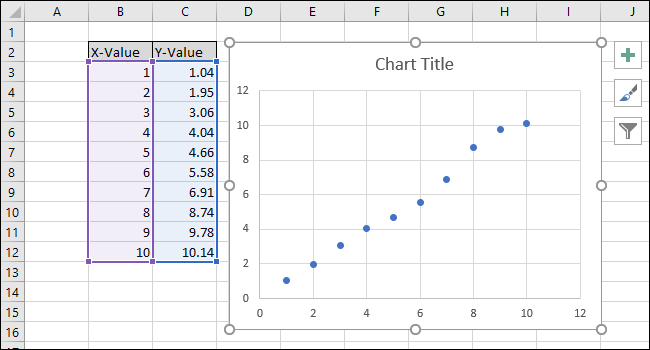
When you open the scatter option, you'll get a chart with data points from the x and y columns.
For example:
Next, you should click on one of the blue points to select the series. Once the series is selected, Microsoft Excel will outline the points.
You should select one of the outlined points and then click on "Add Trendline" from the dropdown menu.
You'll get a straight line that will appear on the chart.
Next, you'll get a "Format Trendline" menu that will appear on the right side of the screen. On the menu, you should check the boxes on "Display R-squared value on chart" and "Display Equation on chart."
The R-squared is a static value that informs you of how closely the trendline fits the data. The best R-squared static value is 1.000, meaning that all the data points touch the line. As the variance between the data points and the line grows, the R-squared value drops. The lowest the R-squared value can go is 0.000.
The trendline's equation and the R-squared static value will appear on your chart.
An example of a trend line equation is Y=Mx + B, where M represents the SLOPE and B stands for the y-axis intercept of the straight line.
When you are through with the calibration, you can continue to go ahead to customize the chart. You can add axis titles and also edit the title.
If you want to change the title, click on "Chart Title" to select the text.
Next, you should type a new title that best describes the chart, e.g., calibration curve.
If you want to add titles to the x-axis and y-axis, you should start by going to the chart tools and then go to "Design." After that, you should click on the "Add a Chart Element" dropdown.
Next, go to the axis titles and then select the Primary Horizontal option.
When you select the option, you'll get an axis title that will appear. If you wish to change the name of the axis title, first, you should select the text and then type in your new name.
After that, go back to the Axis Titles option and then select the Primary Vertical option. You'll get an axis title when you open the option. If you want to change the title, start by selecting the text and then type in your new title.
With that, you are through with creating your chart, getting the equation, and customizing the chart (see also 'Camera Focus Chart').
Calculating the Line Equation and R-Squared Statistic
Now that you have your chart, you can go ahead to calculate the R-Squared statistic and the line equation using the Microsoft Excel CORREL, SLOPE, and INTERCEPT functions.
To calculate the Slope, you should start by going to the spreadsheet and then navigate to the formulas. After that, go to the More Functions option, then go to the Statistical, and navigate to SLOPE.
When you navigate to SLOPE, a Functions Arguments window will pop up. After that, in the "Known_ys" field, you should select or type in the y-value column cells.
Next, in the "Known_xs," you should select or type in the x-value column cells.
Note, when using the SLOPE function, it matters a lot the order of the "known_ys" and "known_xs" fields.
Finally, click "Ok." You will have the final formula in the formula bar that should look like:
=SLOPE(C3:C12,B3:B12)
Note, the value that you get using the SLOPE function is similar to the value on your chart.
Next, you can use the INTERCEPT function to calculate the equation. To use the INTERCEPT function on the excel spreadsheet, go to the Formulas option and then go to More Functions. Next, you should go to the Statistical function and then INTERCEPT.
When you select the INTERCEPT function, the Function Arguments window will pop up. Next, select or type in the y-value column cells for the "known_ys" field.
After that, you should select or type in the x-value column cells for the "known_xs" field. While using the INTERCEPT function, it also matters how you order the "known_ys" and "known_xs" fields.
Finally, you should click "Ok." The final formula for the equation on the formula bar should be like this:
=INTERCEPT(C3:C12,B3:B12)
The value you get when you use the INTERCEPT function matches the y-intercept displayed in the chart.
Next, you can use the CORREL function to get the line equation and the R-squared statistics.
To use the CORREL function, you should navigate the spreadsheet to Formulas and then go to More Functions. Then go to Statistical and then select CORREL.
Next, you'll get a Function Arguments window that will pop up. Unlike in the INTERCEPT and SLOPE functions, the order doesn't affect the results of the CORREL function.
Finally, you should click "Ok." The formula you get on the formula bar should be like this:
=CORREL(B3:B12,C3:C12)
The value returned using the CORREL function doesn't match the R-squared value on your chart. The CORREL function returns "R." As such, you need to square it to calculate the R-squared.
To square the function, click in the function bar and add "^2" to the formula to square the results you get using the CORREL function. Thus, the complete formula should be like this:
=CORREL(B3:B12,C3:C12)^2
When you change the formula, the R-squared value will match the one on your chart.
Set Up Formulas for Calculating Values
Assuming you wanted to create a linear calibration curve in Excel to determine the concentration of an unknown solution.
Now, you can use the values you get from the simple formulas to calculate the concentration of the solution. You should get the steps to help you set up the formulas needed to enter the x-value and y-value to get the corresponding value using the calibration curve.
For the line-of-best-fit, the equation is in the following form:
Y-value = SLOPE * X-value + INTERCEPT
Therefore, if you want to get the y-value, you should multiply the x-value and the SLOPE and then add the INTERCEPT.
If you want to solve the x-value based on the y-value, you should subtract the INTERCEPT from the y-value and then divide the result by the SCOPE.
x-value=(Y-value-INTERCEPT)/SLOPE
In the example we used in our calculation, the INTERCEPT is used as the y-value. The value returned in the calculation is 3.14934E-06, while the x-value you get as a result should be equal to zero. The resulting value is not zero due to the truncation of the x-value. However, the formula for getting the x-value based on the y-value is effective as the final answer from the procedure is 0.00000314934, which is almost zero.
If you enter any x-value that you want into the first thick-bordered cell, Microsoft Excel will go ahead to calculate the corresponding y-value.
Also, entering a y-value in your spreadsheet's second thick boarded cell will result in a corresponding x-value. Thus, you can use the simple formula to calculate the concentration of your unknown solution.
See More Calibration Targets
Kalibr Targets
Halcon Targets
ChArUco Targets
PhotoModeler Targets
Custom Targets
Tailor your board to achieve quality calibration results with high accuracy. You can select from numerous custom products, including circle targets, checkerboard targets, charuco targets, asymmetrical circle targets, and more.
Conclusion
A calibration curve, also known as a standard curve, is vital in analytical chemistry. It comes in handy in trying to determine the concentration of a substance in an unknown sample. With the calibration curve, you compare the unknown sample with standard samples with a known concentration.
The curve is a solution to instrument calibration issues as other methods can mix the standard sample with the unknown sample. To use a calibration curve, you need to prepare standard samples across a range of concentrations. Analyzing the standards using the approach results in some measurements that will show a linear relationship. You can use the measures to interpolate and find the concentration of the unknown sample.
FAQs
1. What is calibration curve method?
The calibration curve method is used for the purpose of determining an unknown sample's concentration in relation to standard samples of known concentrations. The calibration curve, also called the standard curve, is a general approach used in the field of analytical chemistry.2. Is a calibration curve linear?
The calibration curve in a bioanalytical method is a linear relationship between concentration (independent variable) and response (dependent variable). Using this relationship, analyte concentrations in a complex matrix can be predicted.3. How do you use a calibration curve?
Calorimetric curves, also known as standard curves, are used in analytical chemistry to determine the concentration of a substance in an unknown sample by comparing it to a set of standard samples of known concentrations.4. How do you use a calibration curve?
As an example, let's say that y = 1.05x + 0.20 has the general form y = mx + b, where m is the gradient and b is the slope. Adjust measurements made on samples whose values are unknown using the equation of the calibration curve. To find y (the true value), plug in the measured value as x into the equation.5. Is a calibration curve accurate?
A calibration curve is accurate if the data points are plotted correctly and the scale on both axes has been labeled. For example, a calibration curve can be used to measure voltage in volts (V) or current in milliamps (mA). The points should be plotted so that they correspond with the scales on each axis. It is important to label these axes because it will help you read your results more accurately.
Leave A Reply